HoloStudio – Mixed Reality UX Design
The HoloStudio was developed in response to a design brief issued by Dana Karwas, my UX Design professor, in collaboration with Joshua Walton and Nicholas Kamuda of the Microsoft HoloLens team. The HoloStudio envisions an artist studio in mixed reality with a virtual assistant to help guide users through the experience.

Project Overview.
In partnership with Microsoft, our team worked with the Microsoft HoloLens to imagine an app built for HoloLens that would be able to showcase an artists' work.
We went through about three iterations before the project was over. Our final product, the HoloStudio, included a digital assistant, ArtDroid-82 (aka, “Arty”), to help guide users in a mixed reality experience where users could see artwork, resize, reposition, and rotate the artwork, as well as see the process of how the art was created.
Project Brief: Imagine a holographic portfolio that enables you to experience and sense artworks in a new way. Design a proof of concept for a holographic portfolio that covers the end-to-end experience of an artist's portfolio to be viewed on the HoloLens. This is not about creating an “artwork” for the HoloLens, but rather a way to interact with different works in mixed reality on the HoloLens. The approach should be based on the experience of a studio visit.
Full project brief can be found here.
My Role: For this project, I was the Project Manager and UX Designer & Researcher. I managed our team and kept us on track to meet internal deadlines. I also helped with research and design that contributed to our final prototype design for the end of the project.
Understanding the HoloLens.
Our team visited the Microsoft Store of 5th Avenue in NYC to demo the HoloLens. This one-hour session helped us see the capabilities and limitations of the HoloLens.
Brainstorming.
After our team had tested and demoed the HoloLens, we sat down to brainstorm ideas on how to access and display the artwork. We thought about when users could use gestures and voice commands and even when it would make sense to use one or the other. For this project, we knew we were constrained to using the gestures that the HoloLens could recognize.
The culmination of this brainstorming session led us to create the Interactions Concept Map that defines potential interactions with the elements in the experience.
Preliminary Sketches.
After we finished brainstorming, we drew a few quick sketches to help us visualize the idea so we could get feedback. This part of the process also helped us as a team try to develop a more concrete idea to move forward with.
These sketches were shown to our professor, Dana Karwas, as well as to the artists and curators when we interviewed them to allow them to better understand how a mixed reality HoloLens experience might be built.
Table of Elements.
After we could visualize our ideas, we created a Table of Elements to see what we wanted to include in our project. This table gave us a better idea of the aspects of the project that we wanted to focus on for the best user experience.
Artist and Curator Interviews.
To help inform our mixed reality experience, we talked to 3 artists and 2 curators. They provided valuable insight into our project including how art should be represented in mixed reality, feedback on our project, curation styles and techniques, and how we should represent our digital assistant.
Most of the artists and curators were not familiar with the Microsoft HoloLens or mixed reality. After explanations of the technology, the biggest takeaway from these interviews was that there is something very personal about being in the artists’ studio and that a digital experience would never replicate the experience. However, they would be open to using a digital experience to complement the in-person visits.
User Flows.
We developed static and animated user flows to communicate to people how they could be going through the experience.
The more animated visual flow was meant to be used for presentation purposes with someone explaining the process. This allows for better communication and visualization of the mixed reality experience. This animated user flow was well-received during our project check-ins and final presentation to Microsoft.
Prototyping.
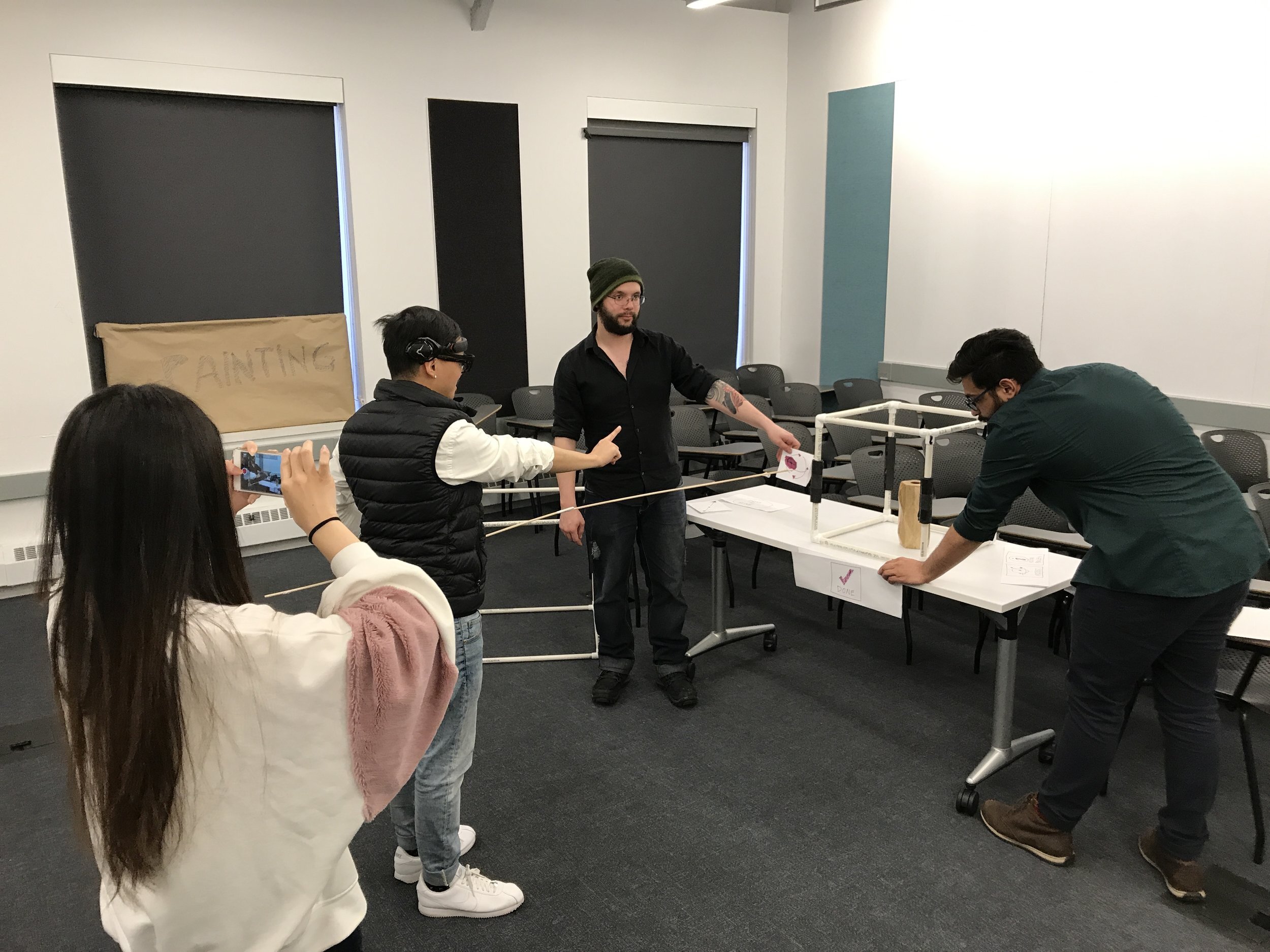
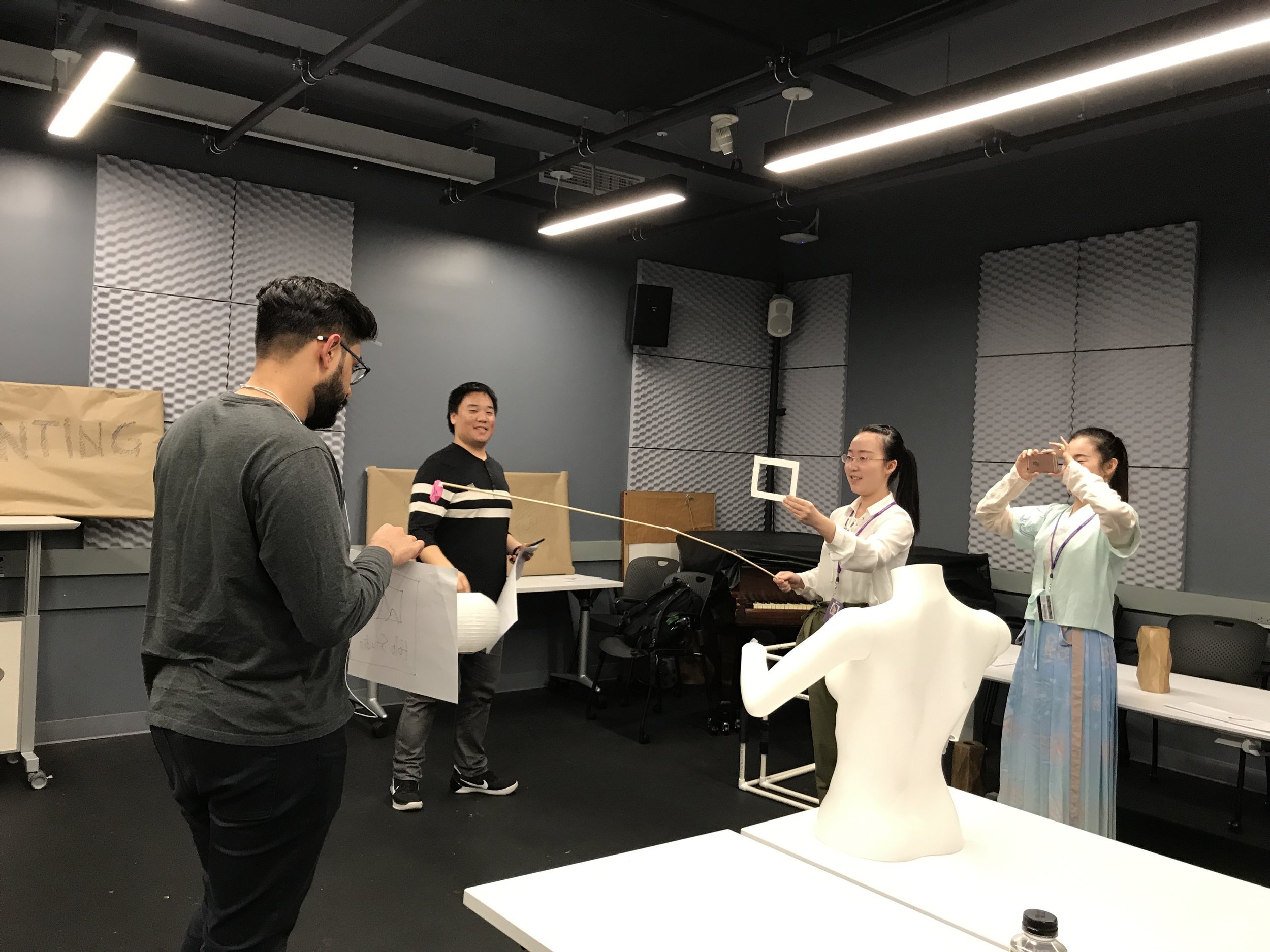
After creating the user flow, we decided to prototype the flow to see if it made sense. At this point, we decided to use resources that were quickly available to us: a roll of brown paper, markers, printer paper, PVC pipes, as well as miscellaneous objects to represent holograms.
Constructing these placeholder holograms allowed us to use bodystorming techniques with these placeholders to adequately communicate what our experience looked like and how users would interact with the artwork in mixed reality. It would prove useful when we tested our prototype experiences with people as it allowed people to understand where and when holograms would appear, as well as how the holograms should appear when they interacted with it.
User Testing and Feedback.
Before we brought our project into Unity, we conducted a few rounds of user testing.
The insight we got from testing included:
Make Arty (our digital assistant) more ambiguous.
Be careful how Arty is represented since the art world can be more in tune with symbolism.
Unifying button layouts.
Think about what Arty would be besides as an on-boarding experience.
Unity Development and 3D Modeling.
We brought our concept into Unity and two team members, Alex and Tyler, worked to program the experience.
Casey was also brought in to help with 3D modeling our digital assistant, Arty.
Concept Visuals.
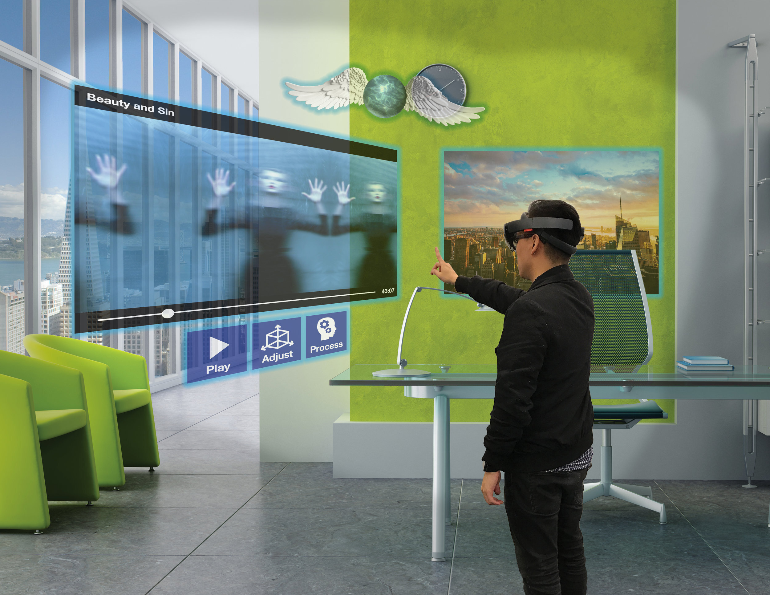
To better communicate our ideas, we created concept visuals to showcase an idealized version of our project, including all types of art pieces as well as UI layout.
Presentation.
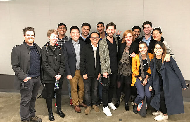
We team, and the rest of our class, presented our ideas to Joshua Walton, Principal Interaction Design at Microsoft HoloLens, and Nicholas Kamuda, Creative Director of Microsoft and Windows Holographic. They both enjoyed our concept and key insights.


